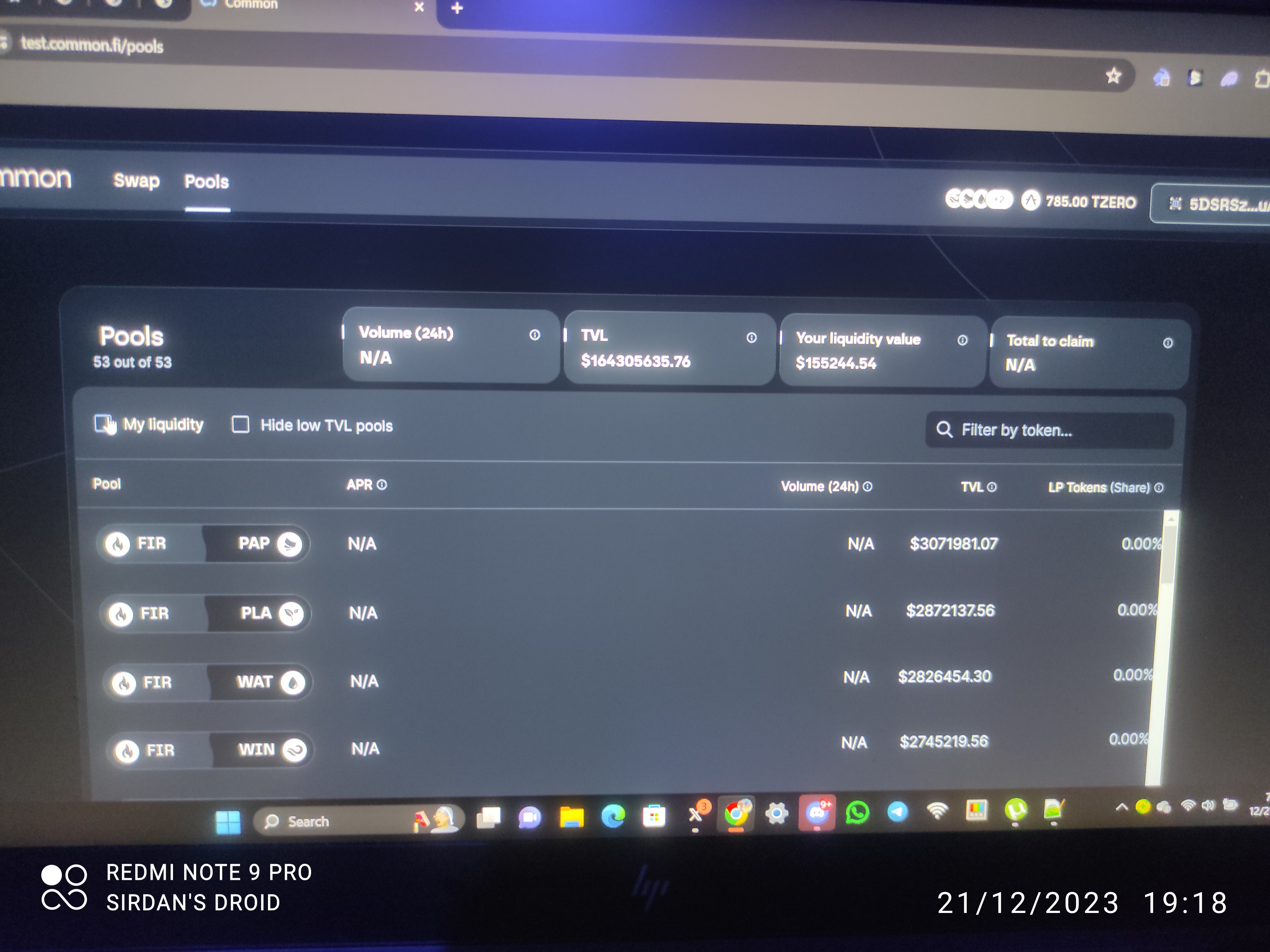
UI improvements
The space between APR and 24h Volume is too wide, tried even on mobile... The details should all be columns and users should be able to shift the columns
Add more filters, e.g by pairs, fire related pairs, paper related pairs, would come in handy when other ecosystems are added. the columns should be able to get toggled, to show from highest TVL to lowest TVL, same goes for LP tokens.
Please authenticate to join the conversation.
Upvoters
Status
Completed
Board
💡 Feature Request
Date
5 months ago
Author

Daniel Ebri
Subscribe to post
Get notified by email when there are changes.
Upvoters
Status
Completed
Board
💡 Feature Request
Date
5 months ago
Author
Daniel Ebri
Subscribe to post
Get notified by email when there are changes.