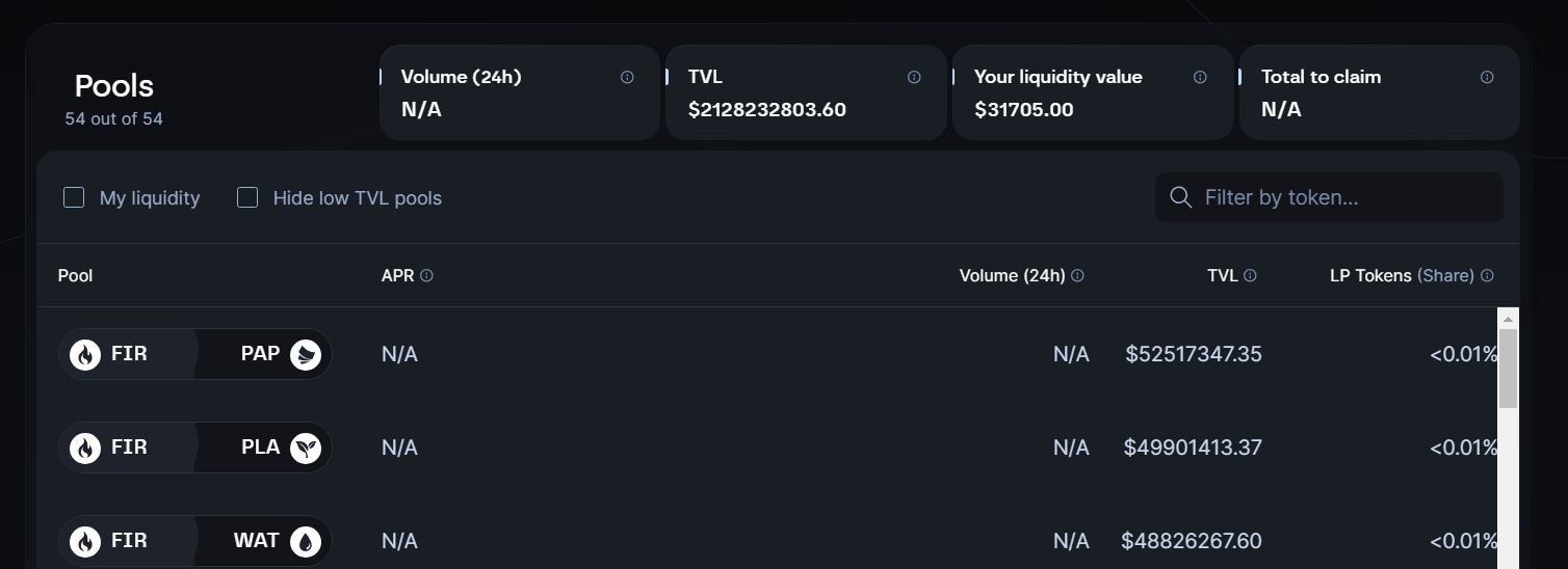
UI Improvement Suggestion
APR columns too big and the LP share % and volume columns need to be centered justified so that the edge of the scroll bar isnt so close, looks like there might be more to the right hand side and theres not. Just a suggestion. Also the colour of th4e scroll bar could be in line theme wise.
Please authenticate to join the conversation.
Upvoters
Status
Completed
Board
DEX and Bridge (WASM)
Date
Over 2 years ago
Author

tom_edmunds21@hotmail.com
Subscribe to post
Get notified by email when there are changes.
Upvoters
Status
Completed
Board
DEX and Bridge (WASM)
Date
Over 2 years ago
Author
tom_edmunds21@hotmail.com
Subscribe to post
Get notified by email when there are changes.